Styling SwiftUI Views
How does view styling work?
SwiftUI makes it easy to customise views In most situations, using the built-in view modifiers is enough. For example, here is a Text view on a pink rounded rectangle:
Text("Hello, World!")
  .padding(8)
  .background(.pink, in: RoundedRectangle(cornerRadius: 8, style: .continuous))
  .foregroundColor(.white)
  .bold()
For more complicated layouts, we can combine multiple simple SwiftUI views into a more complex views, for example by making use of SwiftUI’s stacks:
struct TodoListRowView: View {
  private let onStyle: AnyShapeStyle = AnyShapeStyle(.tint)
  private let offStyle: AnyShapeStyle = AnyShapeStyle(.gray)

  @Binding var todo: Todo

  var body: some View {
    HStack {
      Image(systemName: todo.completed ? "largecircle.fill.circle"
                                       : "circle")
      .resizable()
      .frame(width: 24, height: 24)
      .foregroundStyle(todo.completed ? onStyle : offStyle)
      .onTapGesture {
        todo.completed.toggle()
      }
      Text(todo.title)
    }
  }
}
But sometimes, this isn’t such a great idea: complex views might obscure the actual intent of the respective UI. This is especially true if we’re building a custom view to replace functionality that SwiftUI and the operating system provide out of the box.
To alleviate this problem, we can refactor complex views into smaller, more specific views. I’ve talked about this strategy in-depth in my video series Building SwiftUI Components.
I am a great fan of refactoring views in to smaller, reusable parts, but today, I’d like to talk about another strategy you should know about.
To better understand this strategy, let’s for a moment consider the Swift language itself. In Swift, we use classes and structs to express the structure and behaviour of our apps. Some of the structs and classes in our apps expose similar structures and behaviours, and one way to express this is to use protocols. Just like classes and structs can conform to protocols to make it easier for developers to know what kind of general behaviour to expect from a specific class or struct, this applies to views as well.
For example, we expect a button to behave like a button, no matter its shape: when a user clicks on a button, we expect an action to be performed. But we also might want to be able to change the looks and design of a button completely, without having to reimplement all the basic functionality over and over again.
View styles
The designers of SwiftUI realised this early on, and created a mechanism that allows us to change the design of a UI element without breaking the contract for its behaviour: View styles.
View styles enable SwiftUI to present a view in the most appropriate way for a particular presentation context. The most prominent example is Label, which can either be presented as an icon, a text, or both, depending on which platform the app runs on and whether the Label appears in a List , a toolbar, etc.
Let’s look at an example to see how view styles work, and how we can implement custom view styles.
Styling Toggles
Toggle is one of the SwiftUI views that support styling. Its default style is probably one of the most iconic UI elements on iOS, prominently known from the settings app:
Since this is the default style, we don’t need to explicitly specify it - SwiftUI will use it automatically:
Toggle(isOn: $isOn) {
  Text("Have you tried turning it \(isOn ? "off" : "on")?")
}
If - for some reason (more about this later) - we want to set the style explicitly, we can apply the .toggleStyle view modifier, using one of the styles that conform to ToggleStyle:
Toggle(isOn: $isOn) {
  Text("Have you tried turning it \(isOn ? "off" : "on")?")
}
.toggleStyle(.switch)
It’s worth noting that .switch is just a shorthand notation for SwitchToggleStyle(), and this gives us a way to tint the background of the switch. So if you wanted to use a pink background for a particular Toggle, you can do so:
Toggle(isOn: $isOn) {
  Text("Have you tried turning it \(isOn ? "off" : "on")?")
}
.toggleStyle(SwitchToggleStyle(tint: .pink))
That’s not the only way to tint the background - you can also apply the .tint view modifier, like so:
Toggle(isOn: $isOn) {
  Text("Have you tried turning it \(isOn ? "off" : "on")?")
}
.tint(.blue)
In case you’re not a fan of this faux-skeuomorphic design, Toggle also supports a more push-button like style:
Toggle(isOn: $isOn) {
  Text("Have you tried turning it \(isOn ? "off" : "on")?")
}
.toggleStyle(.button)
Interestingly enough, ButtonToggleStyle doesn’t support a tint parameter, so if you’d like to tint a button-styled Toggle, you will have to apply the .tint view modifier:
Toggle(isOn: $isOn) {
  Text("Have you tried turning it \(isOn ? "off" : "on")?")
}
.toggleStyle(.button)
.tint(.pink)
Implementing a custom style
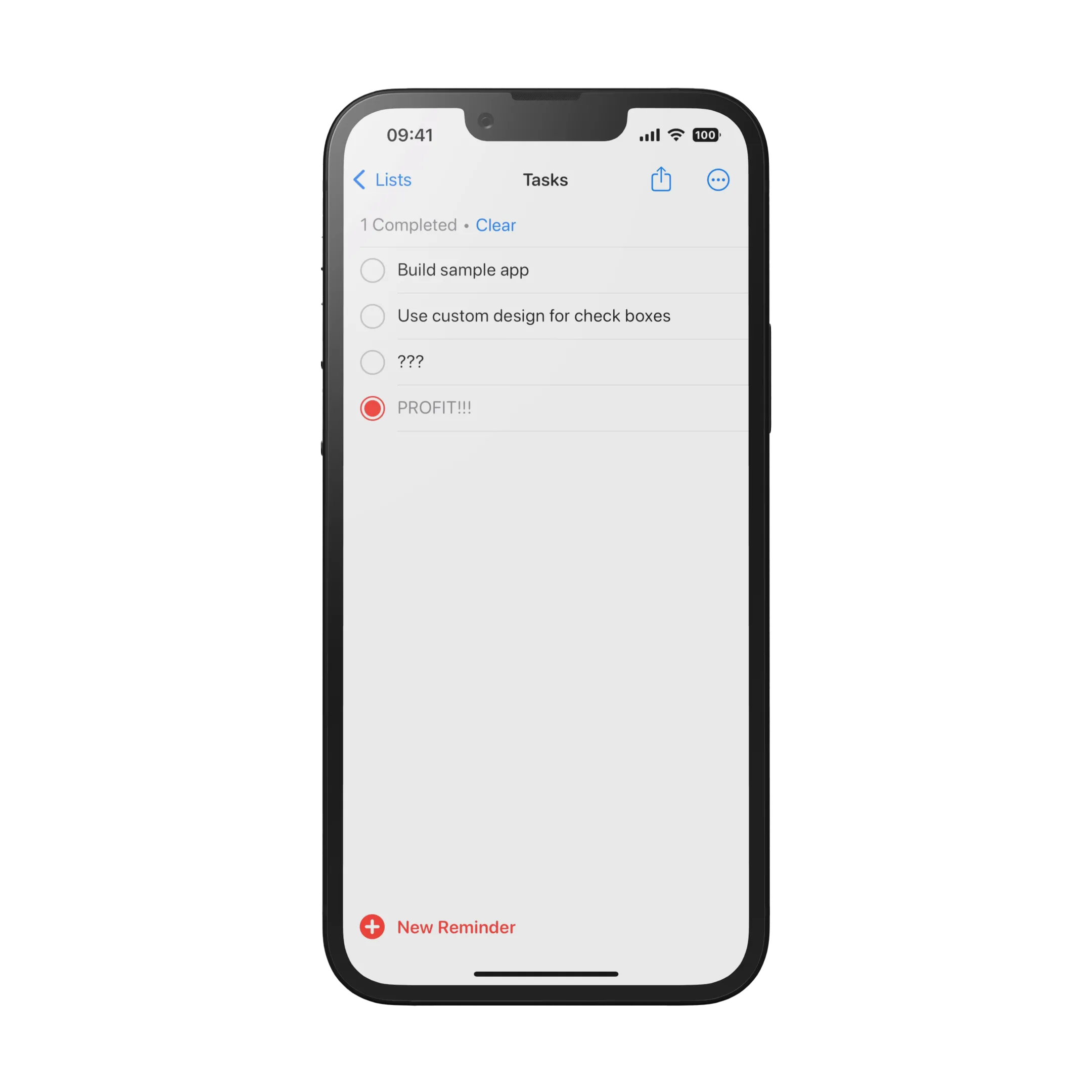
The existing Toggle styles are great for many situations, but what if your designer shows you a design that clearly calls for a Toggle, but doesn’t look like any of the built-in designs? Check boxes for a todo-list app are a prime example:
Now, you might go ahead and implement this using an Image, just like in this code snippet:
struct TodoListRowView: View {
  private let onStyle: AnyShapeStyle = AnyShapeStyle(.tint)
  private let offStyle: AnyShapeStyle = AnyShapeStyle(.gray)

  @Binding var todo: Todo

  var body: some View {
    HStack {
      Image(systemName: todo.completed ? "largecircle.fill.circle"
                                       : "circle")
      .resizable()
      .frame(width: 24, height: 24)
      .foregroundStyle(todo.completed ? onStyle : offStyle)
      .onTapGesture {
        todo.completed.toggle()
      }
      Text(todo.title)
    }
  }
}
This works just fine, but you lose the benefit of the semantics that a Toggle gives you, making your code harder to read for your fellow developers and your future self.
Thankfully, implementing a custom style takes just a couple of lines of code - and we can even reuse some of the code from our naive implementation.
To implement a custom style for the Toggle view, we need to create a struct that conforms to the ToggleStyle protocol. This protocol has one requirement, the makeBody function:
struct ReminderToggleStyle: ToggleStyle {
  func makeBody(configuration: Configuration) -> some View {
  }
}
The makeBody function works similar to the body computed property on a regular SwiftUI view, but it receives a parameter with the configuration of the style. The Configuration of a style contains specific information about the view this style is applied to. In the case of ToggleStyleConfiguration, it contains the label of the Toggle, as well as the state (isOn), and another state (isMixed) that comes into play when using nested toggles:
@available(iOS 13.0, macOS 10.15, tvOS 13.0, watchOS 6.0, *)
public struct ToggleStyleConfiguration {

  /// A type-erased label of a toggle.
  public struct Label : View {
    public typealias Body = Never
  }

  /// A view that describes the effect of switching the toggle between states.
  public let label: ToggleStyleConfiguration.Label

  /// A binding to a state property that indicates whether the toggle is on.
  @Binding public var isOn: Bool { get nonmutating set }

  public var $isOn: Binding<Bool> { get }

  /// Whether the ``Toggle`` is currently in a mixed state.
  @available(iOS 16.0, macOS 13.0, tvOS 16.0, watchOS 9.0, *)
  public var isMixed: Bool
}
Inside makeBody, we can use any SwiftUI view we like to implement the look and feel of the Toggle:
struct ReminderToggleStyle: ToggleStyle {
  private let onStyle: AnyShapeStyle = AnyShapeStyle(.tint)
  private let offStyle: AnyShapeStyle = AnyShapeStyle(.gray)

  func makeBody(configuration: Configuration) -> some View {
    HStack {
      configuration.label 1
      Image(systemName: configuration.isOn ? "largecircle.fill.circle" 2
                                           : "circle")
        .resizable()
        .frame(width: 24, height: 24)
        .foregroundStyle(configuration.isOn ? onStyle : offStyle) 3
        .onTapGesture {
          configuration.isOn.toggle() 4
        }
    }
  }
}
A couple of notes about the implementation:
- For this particular style, we don’t really care about the label of the
Toggle, but I’ve decided to put it here, mostly so you can see how you can access it. When using this style, we will just leave thelabelparameter of theToggleempty - you will see this in a moment. - We use an
Imageto represent the state of the toggle. To detect the state, we access theisOnbinding on theconfigurationparameter. - Similarly, we use the
isOnbinding to tint the image when the toggle is in itsonposition. - And finally, we use
onTapGestureto toggle theTogglewhen the user taps on the image.
Finally, to make using this new style more convenient, we extend ToggleStyle to allow us to use .reminder as a shortcut notation for setting the style:
extension ToggleStyle where Self == ReminderToggleStyle {
  static var reminder: ReminderToggleStyle {
    ReminderToggleStyle()
  }
}
Using the new style
Here is a simple todo list that makes use of the new custom toggle style:
struct TodoList: View {
  @State var tasks: [Todo]
  var body: some View {
    List($tasks) { $task in
      HStack {
        Toggle(isOn: $task.completed) {  } 1
          .toggleStyle(.reminder)
          .tint(.red)
        Text(task.title)
      }
    }
    .listStyle(.plain)
    .navigationTitle("Tasks")
  }
}Using a Toggle with a custom style instead of a home-grown solution (as in the code snippet I showed you in the beginning of this post) makes it much easier to express the intent. The code looks a lot cleaner, and will be much easier to understand for anyone else reading it (including your future self).
Look after the environment
Before wrapping up, let’s take a look at one more aspect of view styles: SwiftUI propagates view styles down the view hierarchy (by using the SwiftUI environment). This is super convenient when you want to use the same style for several views. Just make sure they are children of the same container view, and apply the respective style to the container:
extension ToggleStyle where Self == SettingsToggleStyle {
  static var settings: SettingsToggleStyle {
    SettingsToggleStyle()
  }
}

struct SettingsToggleStyle: ToggleStyle {
  private let onStyle: AnyShapeStyle = AnyShapeStyle(.tint)
  private let offStyle: AnyShapeStyle = AnyShapeStyle(.gray)

  func makeBody(configuration: Configuration) -> some View {
    HStack {
      configuration.label
      Spacer()
      Image(systemName: configuration.isOn ? "square.fill"
                                           : "square")
        .resizable()
        .frame(width: 24, height: 24)
        .foregroundStyle(configuration.isOn ? onStyle : offStyle)
        .onTapGesture {
          configuration.isOn.toggle()
        }
    }
  }
}

struct SettingsView: View {
  @State var sync = true
  @State var detectDates = false
  @State var sendReminders = false
  var body: some View {
    Form {
      Toggle(isOn: $sync) {
        Text("Sync tasks in real-time")
      }
      Toggle(isOn: $detectDates) {
        Text("Detect due dates in tasks automatically")
      }
      Toggle(isOn: $sendReminders) {
        Text("Send daily reminder")
      }
    }
    .toggleStyle(.settings)
    .tint(.pink)
    .navigationTitle("Settings")
  }
}
If you want to override the style for a particular view, you can do so by applying a different style to it.
Where to go next?
Styling views is a powerful concept that gives us a lot of flexibility when designing out apps without losing the semantics of the views we use.
The list of SwiftUI views that support this concept is quite impressive: buttons, pickers, menus, toggles, indicators, text and labels, collection views, navigation views, windows and toolbars, and groups. So the next time you need a special look and feel for a UI element, check out Apple’s documentation first to see if there already is a style for what you need. And if there is no style that meets your needs, you now know how to create a custom one!
You can even build your own styleable SwiftUI views - and this is what we’re going to look at next time!
Agentic Coding in Xcode with Gemini CLI
Build apps with AI assistance in Xcode using Gemini CLI
Turn Your Photos Into Miniature Magic with Nano Banana
Build stunning image generation apps in iOS with just a few lines of Swift
Reverse-Engineering Xcode's Coding Intelligence prompt
A look under the hood
Extracting structured data from PDFs using Gemini 2.0 and Genkit
Understanding SwiftUI Preferences
SwiftUI Parent / Child View Communication