Creating custom SF Symbols using the SF Symbols app
No Design Skills Needed
SF Symbols are icons on steroids: they are vector-based (and thus can be losslesly scaled to arbitrary resolutions), they consist of multiple layers (which can be independenly coloured), and they can even be animated.
They also just look really great, thanks to the hard work Apple’s designers put into creating them.
There are literally thousands of them, so chances are that you will find the perfect fit for your needs. Finding the right one is a whole other story - this WWDC video has a couple of nifty tips and tricks for searching and organising SF Symbols.
Sometimes, however, you might not be able to find the perfect SF Symbol for your need. Thankfully, you can create your own SF Symbols. Apple provides templates for creating new SF Symbols using your favourite vector graphics tool, and there are plenty of articles that demonstrate how to do this using Figma, Sketch, or Adobe Illustrator.
But in this article, I’m going to show you how you can create new symbols without being a designer or having access to those tools.
Using SF Symbols to create SF Symbols

In many cases, all we need is a variation of an existing SF Symbol, for example a document with a badge to indicate the status of the document (e.g. read / unread). Or, a striked through version of an icon to indicate a certain feature is disabled.
The SF Symbols app includes a feature that allows us to create new SF Symbols by combining existing SF Symbols with a bunch of common adornments.
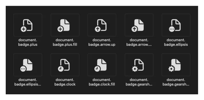
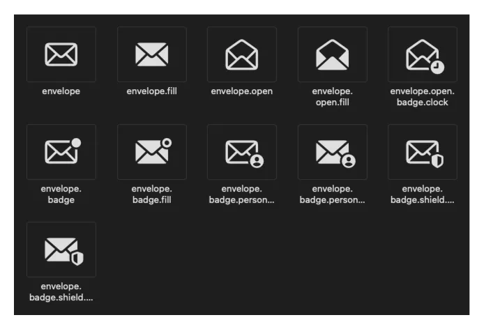
Let’s look at an example. For an app I am working on, I needed a version of the text.document SF Symbol with a badge to indicate its read / unread state. Now, there already are a number of variations of the document symbol, but none of them had a notification indicator like the one for unread emails in Apple’s stock mail app.
To create a new variation of the text.document symbol, follow these steps:
- Create a new custom symbol based on the base symbol: Find the base symbol, and then select Duplicate as Custom Symbol from the context menu.
- Select the custom symbol and select Combine Symbol with Component… from the context menu.
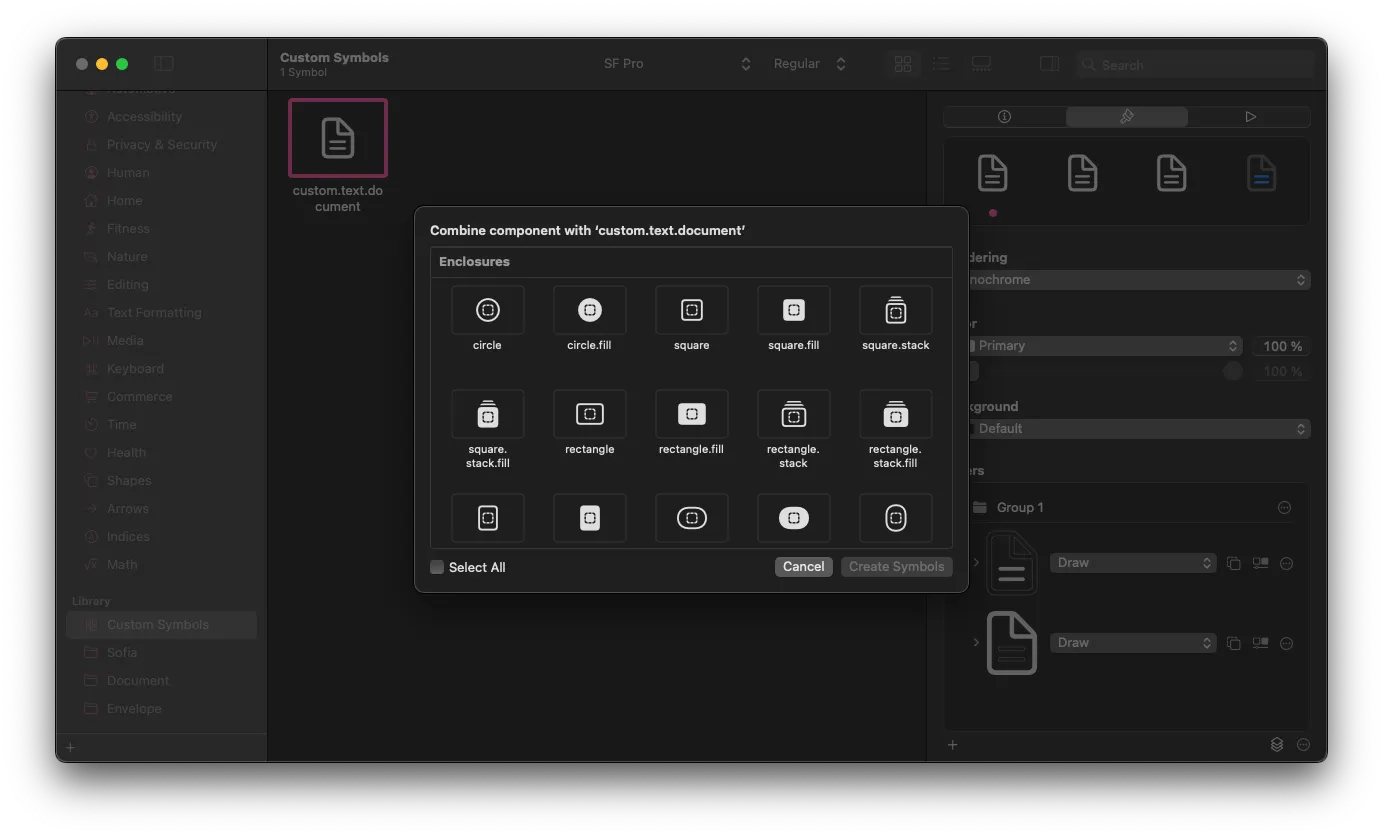
- A dialog appears, showing a list of components from three categories: Enclosures (such as circle, seal, bubble, rectangle stack, and more), different types of badges, and slash.
- In our example, pick
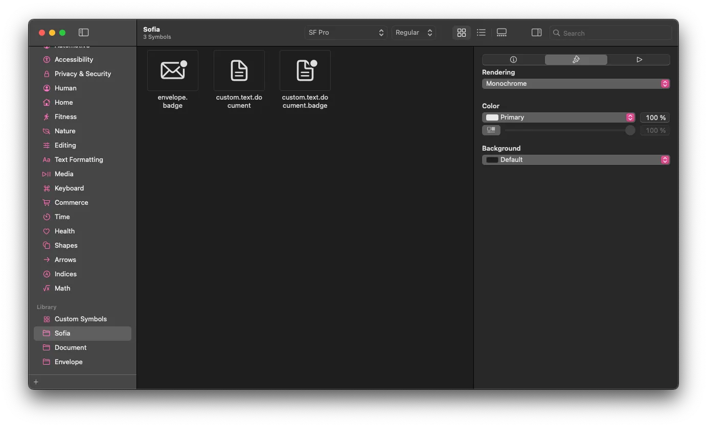
badgefrom the Badges section, and click on Create Symbols (you can apply the same component to several source symbols at the same time. You can even apply several components to the same symbol(s) at the same time.) - You can now adjust the individual aspects of your new custom symbol. In our example, let’s move the badge to the top right, as can be seen on
envelope.badge. - To move the badge to the top right, set the Y Offset of the badge to
10%to match the design of theenvelope.badgesymbol.
Using your new custom symbol in Xcode
Before you can use your new custom symbol in your app, you need to export it from the SF Symbols app and import it into your Xcode project.
- Select your new symbol in the SF Symbols app.
- Click on File > Export Symbol… (or press
⇧ ⌘ E). - Pick the correct Xcode version, and then click on Export.
- Save the resulting SVG file to a convenient location.
- Open your Xcode project, and select its asset catalog.
- Drag the SVG file into your asset catalog.
You can now use your new custom SF Symbol in your app. Here are a couple of code snippets that demonstrate common use cases:
Image("textDocumentBadge")
Label("Unread", image: "textDocumentBadge")
You can even refer to your new SF Symbol using an image reference using . textDocumentBadge:
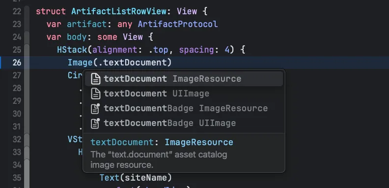
Note that you cannot refer to custom SF Symbols using the systemName: parameters (e.g. Image(systemName: “textDocumentBadge”) .
Further reading
To learn more about SF Symbols and how to use them in your apps, I recommend reading the SF Symbols section in the HIG - it provides a lot of useful backround information, including a section with considerations for custom symbols.
If you’d like to learn how to edit SF Symbols in tools like Figma or Sketch, or how to create entirely new ones, I recommend the following resources:
- Danijela Vrzan: Create Custom SF Symbols in Sketch
- WWDC 2021: Create custom symbols
- Apple Docs: Creating custom symbol images for your app
The header image is based on San Francisco by Philipp Petzka from Noun Project (CC BY 3.0)

Agentic Coding in Xcode with Gemini CLI
Build apps with AI assistance in Xcode using Gemini CLI

Turn Your Photos Into Miniature Magic with Nano Banana
Build stunning image generation apps in iOS with just a few lines of Swift

Reverse-Engineering Xcode's Coding Intelligence prompt
A look under the hood

Extracting structured data from PDFs using Gemini 2.0 and Genkit

Understanding SwiftUI Preferences
SwiftUI Parent / Child View Communication
