
Styling List Views
The Ultimate Guide to SwiftUI List Views - Part 3
Lists offer a wide range of styling options, and with SwiftUI 3, it is now possible to configure almost all aspects of list views:
- the overall appearance of the list itself (i.e. the list style)
- the look of the list cells
- the dividers (finally!)
- … and much more
In this part of the series, we’re going to look at what’s possible.
List Styles
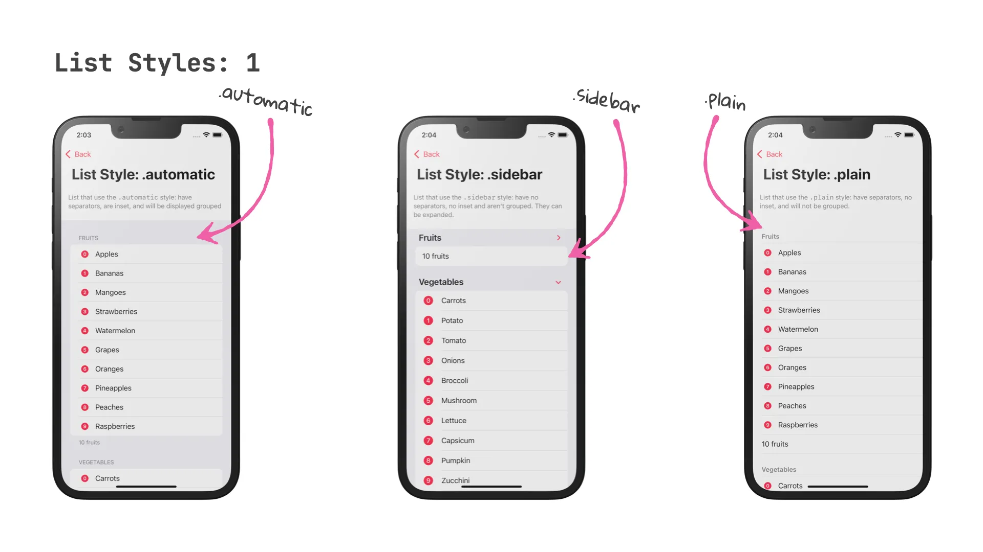
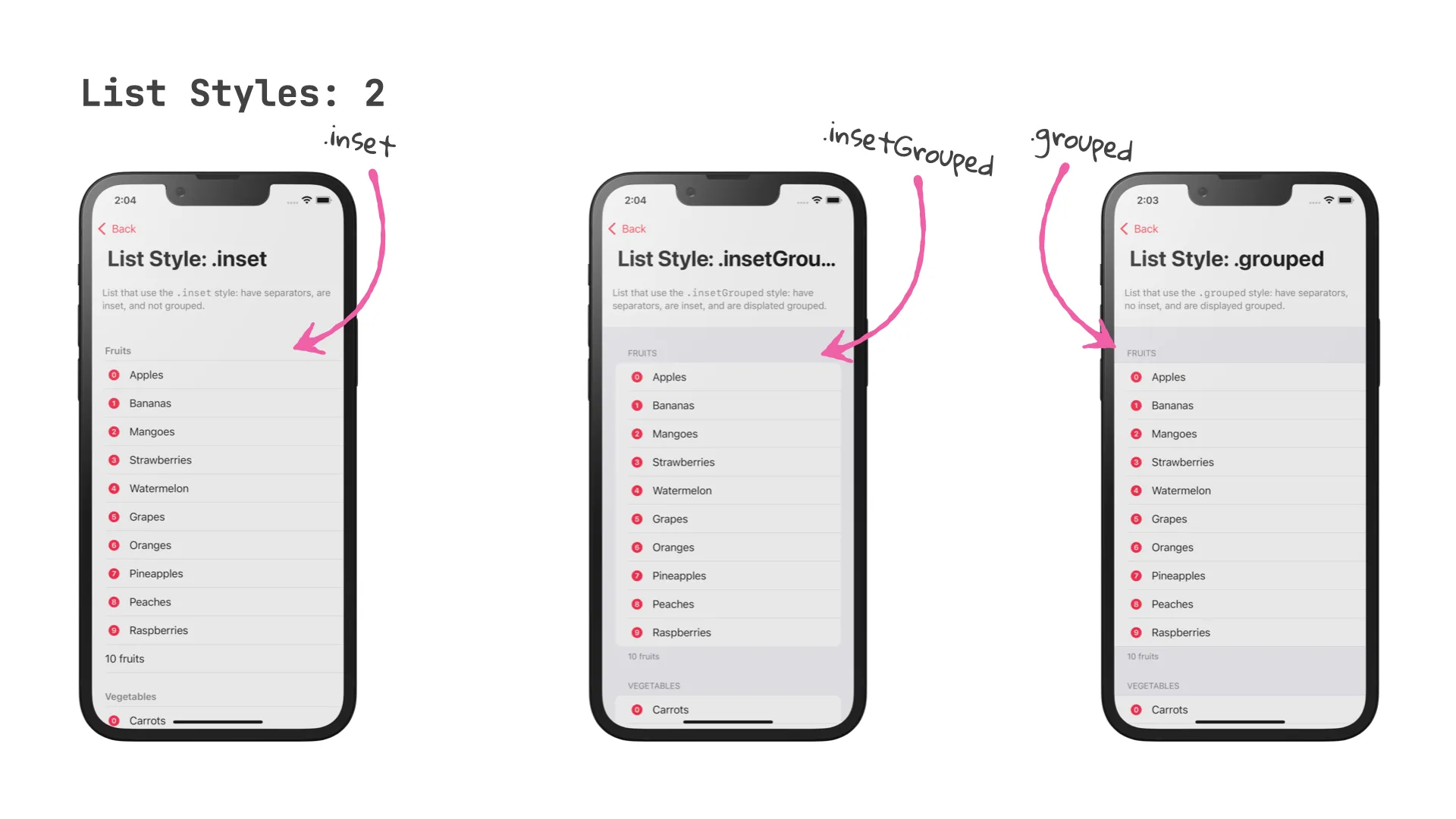
The overall look and feel of list views can be controlled with the .listStyle view modifier. SwiftUI supports five different looks:
.automatic.grouped.inset.insetGrouped.plain.sidebar
List(items) { item in
  Text("\(item.label)")
}
.listStyle(.plain)
If you don’t provide a style, SwiftUI will assume .automatic. On iOS, .automatic and .insetGrouped have the same look.
Instead of trying to describe in words how each of the styles look like, here is an image that shows each of the styles.
Headers and footers
All of the List view styles support headers and footers. To specify a header and / or footer for a section, use one of the constructors that take a header or footer parameter.
It seems like my favourite way of creating headers and footers has been marked for deprecation:
@available(iOS 13.0, macOS 10.15, tvOS 13.0, watchOS 6.0, *)
extension Section where Parent : View, Content : View, Footer : View {

    /// Creates a section with a header, footer, and the provided section content.
    /// - Parameters:
    ///   - header: A view to use as the section's header.
    ///   - footer: A view to use as the section's footer.
    ///   - content: The section's content.
    @available(iOS, deprecated: 100000.0, renamed: "Section(content:header:footer:)")
    @available(macOS, deprecated: 100000.0, renamed: "Section(content:header:footer:)")
    @available(tvOS, deprecated: 100000.0, renamed: "Section(content:header:footer:)")
    @available(watchOS, deprecated: 100000.0, renamed: "Section(content:header:footer:)")
    public init(header: Parent, footer: Footer, @ViewBuilder content: () -> Content)
}
Here is my preferred way of setting up header and footer for a section:
List {
  Section(header: Text("Fruits"), footer: Text("\(fruits.count) fruits")) {
    ForEach(fruits, id: \.self) { fruit in
      Label(fruit, systemImage: "\(fruits.firstIndex(of: fruit) ?? 0).circle.fill" )
    }
  }
}
And here is the new way of doing the same:
List {
  Section {
    ForEach(fruits, id: \.self) { fruit in
      Label(fruit, systemImage: "\(fruits.firstIndex(of: fruit) ?? 0).circle.fill" )
    }
  } header: {
    Text("Fruits")
  } footer: {
    Text("\(fruits.count) fruits")
  }
}
I’ll leave it up to you to decide which one looks cleaner - when executed, they do exactly the same.
List Cells
Designing custom cells used to be a pretty complicated affair in the early days of UITableViewController, and thankfully, things have gotten a lot easier since then.
In SwiftUI, designing custom List rows is easy to get started (just use a plain Text view to represent the current item), but the possibilities are endless, as you can make use of SwiftUI’s flexible stack-based layout system. For a general introduction to building custom List rows, check out the first part of this series, which covers some basic techniques.
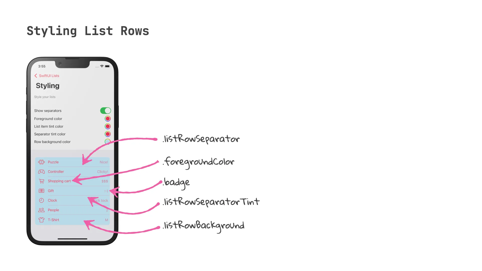
In addition, SwiftUI supports a number of ways for styling common aspects of List rows, such as their background, their inset, accent color, tint, and badges.
Here is a code snippet that shows how you can configure a list row:
List(items, id: \.title) { item in
  Label(item.title, systemImage: item.iconName)
    .badge(item.badge)
    // listItemTint and foregroundColor are mutually exclusive
    // .listItemTint(listItemTintColor)
    .foregroundColor(foregroundColor)
    .listRowSeparator(showSeparators == true ? .visible : .hidden)
    .listRowSeparatorTint(separatorTintColor)
    .listRowBackground(rowBackgroundColor)
  }
}
Separators
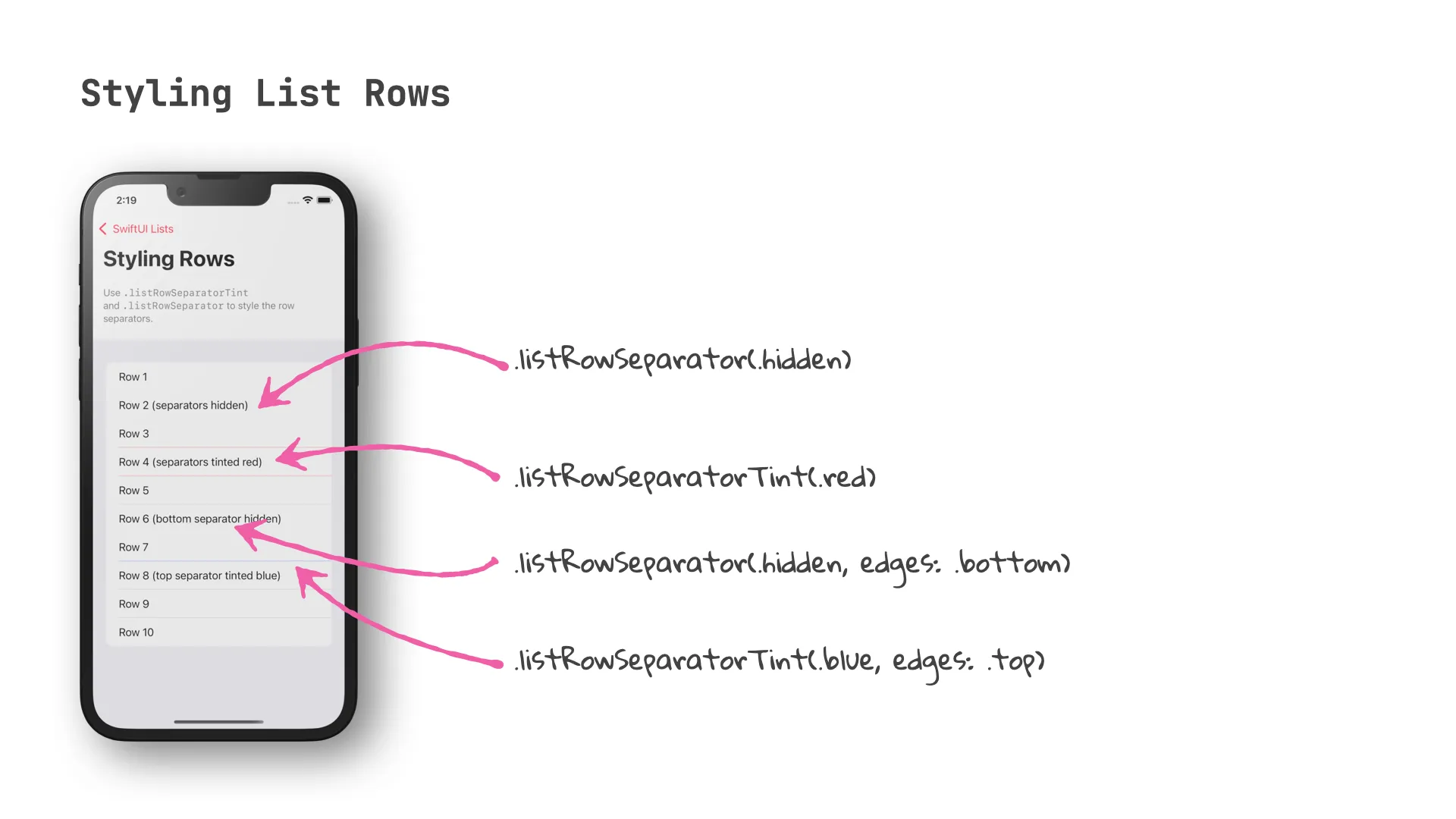
As any designer will be able to tell you, the space between items is as important as the items themselves. With SwiftUI 3, it is now possible to influence the style of row separators and section separators: both the tint color and the visibility can be controlled. SwiftUI’s flexible DSL makes it easy to control this for an entire List view or for individual rows and sections.
To control the appearance of row separators, you can use .listRowSeparator() and .listRowSeparatorTint(). You can specify which edges (.top or .bottom) you want to configure. If you don’t provide any value for the edges parameter, both top and bottom will be modified.
List {
  Text("Row 1")
  Text("Row 2 (separators hidden)")
    .listRowSeparator(.hidden)
  Text("Row 3")
  Text("Row 4 (separators tinted red)")
    .listRowSeparatorTint(.red)
  Text("Row 5")
  Text("Row 6 (bottom separator hidden)")
    .listRowSeparator(.hidden, edges: .bottom)
  Text("Row 7")
  Text("Row 8 (top separator tinted blue)")
    .listRowSeparatorTint(.blue, edges: .top)
  Text("Row 9")
  Text("Row 10")
}
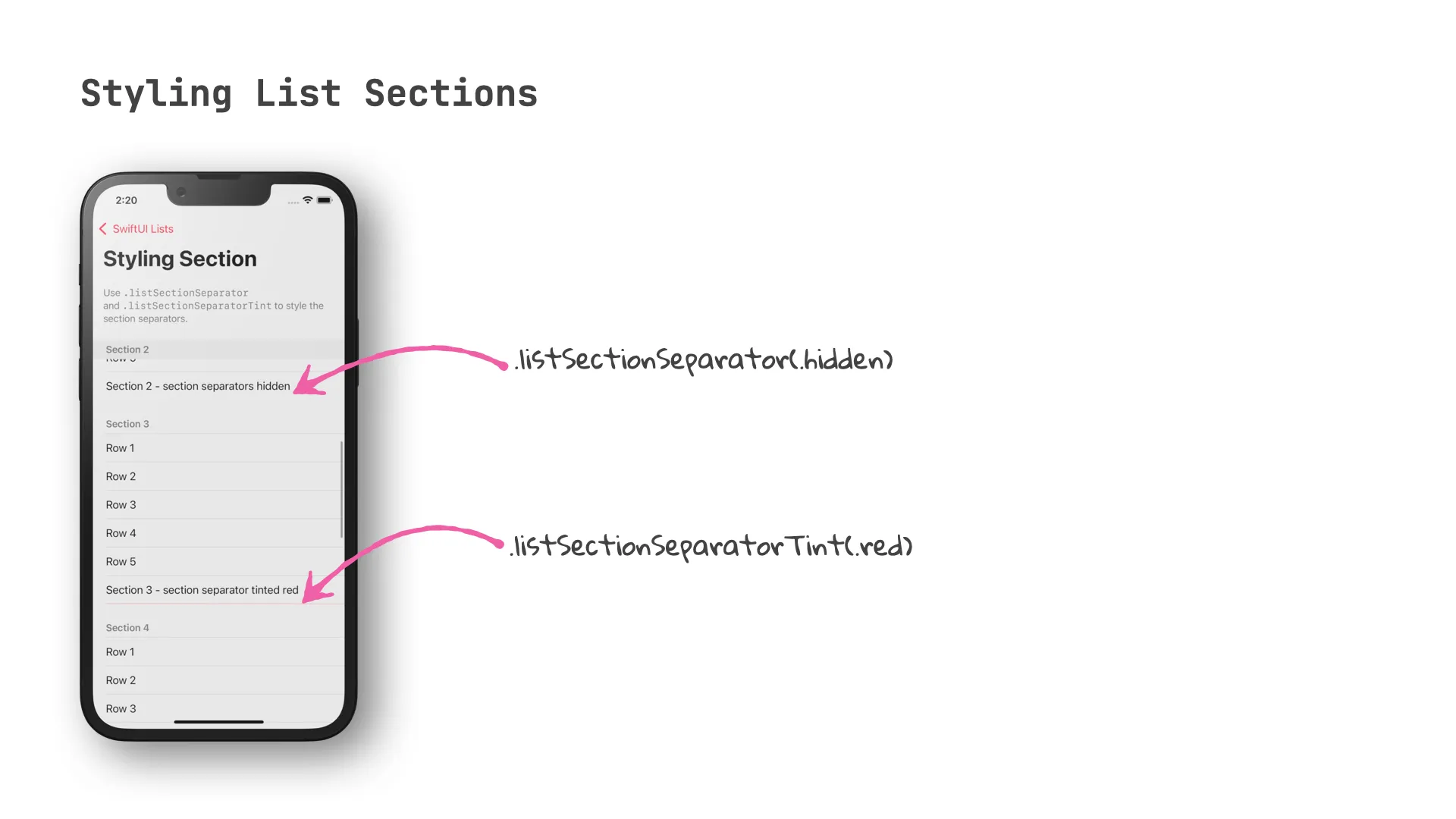
To control the appearance of section separators, use .listSectionSeparator() and .listSectionSeparatorTint(). Just like the view modifiers for list rows, both of these view modifiers support specifying the edges you’d like to modify.
List {
  Section(header: Text("Section 1"), footer: Text("Section 1 - no styling")) {
    Text("Row 1")
  }
  Section(header: Text("Section 2"), footer: Text("Section 2 - section separators hidden")) {
    Text("Row 1")
  }
  .listSectionSeparator(.hidden)

  Section(header: Text("Section 3"), footer: Text("Section 3 - section separator tinted red")) {
    Text("Row 1")
  }
  .listSectionSeparatorTint(.red)

  Section(header: Text("Section 4"), footer: Text("Section 4 - section separators tinted green")) {
    Text("Row 1")
  }
  .listSectionSeparatorTint(.green, edges: [.top, .bottom])

  Section(header: Text("Section 5"), footer: Text("Section 5 - section separator (bottom) hidden")) {
    Text("Row 1")
  }
  .listSectionSeparator(.hidden, edges: .bottom)

  Section("Section 6") {
    Text("Row 1")
  }
}
Closure
If you’ve worked with SwiftUI since its early days, you will appreciate that it now supports styling all aspects of List views, from the overall look and feel down to the tint color and visibility of the list item separators.
In the next episode, we will look at a feature that puts a lot of power into your user’s hands (or rather fingertips): swipe actions! Implementing swipe actions used to be notoriously difficult in the past, and it doesn’t come at any surprise that SwiftUI is making this easier than ever before.
Thanks for reading, and until next time!
Agentic Coding in Xcode with Gemini CLI
Build apps with AI assistance in Xcode using Gemini CLI

Turn Your Photos Into Miniature Magic with Nano Banana
Build stunning image generation apps in iOS with just a few lines of Swift

Reverse-Engineering Xcode's Coding Intelligence prompt
A look under the hood
Extracting structured data from PDFs using Gemini 2.0 and Genkit
Understanding SwiftUI Preferences
SwiftUI Parent / Child View Communication